Photoshop DJing, a tutorial.

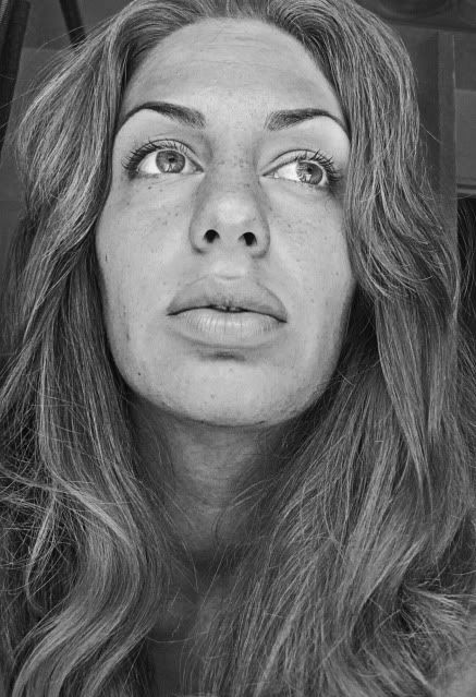
After posting this photo, I've gotten numerous comments remarking how sketch-like it was and wondering how it was done. I haven't done a tutorial in a while, so...bottoms up!
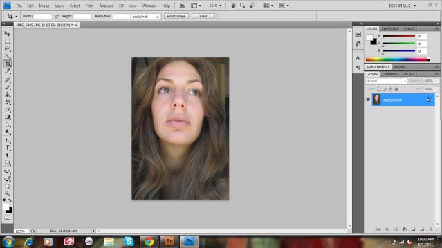
I didn't feel like redoing the same image, so I chose another one that I took in the same cam-whoring session. Both these photos were taken in simple, diffused window light. The light in the photo is important to the effect--things need to be exposed evenly. Click the screenshots for a larger view.
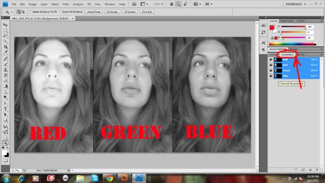
Now, I need to you click the Channels tab on the Layers palette. Here you will see an RGB channel, and the Red, Green, and Blue channels separately. An RGB image is a composite of, obviously, all the Reds, Greens, and Blues in the picture. Each pixel is a combination of different percentages or each. The programming in our precious Photoshop doesn't actual "see" direct color though, so the numbers that make up the color percentages of each pixel are determined through the 3 separate B&W channels that Photoshop does see, using the amount of grey in the channel as a filter for how much of the color would shine through into the full composite image.
Above, I've displayed all three channels of the image I'm working with. You can see that skin tones etc. that have warmer, more red colors, are very light in the Red channel, but not so much in the Green and Blue. If this were, say, a photo of the ocean, the Blue channel would be primarily light instead. How I'm using the channels here is to manually define the tones in the finished B&W image. I want the glowing, lighter tones for the hair and eyes, and the detailed, darker tone for the skin, so I'll be using the Red and the Blue channels.
Click on the Red channel to display it, then Select All, Copy, click back to RGB and back to the Layers tab, and Paste. Repeat for the Blue channel.

Now your Layers palette should look something like this. Your original, a B&W Red copy, and a B&W Blue copy. The trick to mixing the two B&W layers is using a Layer mask. Select the top layer, then click the Layer Mask icon on the Layers palette (circled--or Layer>>Layer Mask>>Reveal All). This will give you an essentially empty canvas next to your layer that you can draw on with the brush tool to define what shows and what doesn't. Make sure you're painting with black to mask parts of the layer off, and white white to bring them back. The great thing about Layer Masks is that you can always change your mind without permanently erasing the actual layer!
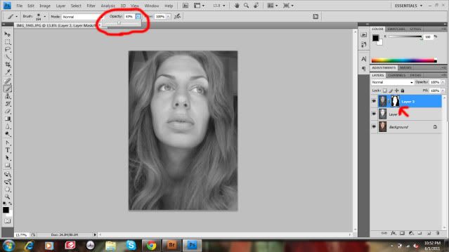
I masked off the hair and eyes by drawing over them in the Layer Mask, as you can see in the thumbnail. You can also change the opacity (circled--essentially the strength) of your brush while painting for a less severe mask in certain places or however you see fit. Now the parts of the layer that I didn't mask off--the skin primarily--are darker like they are in the Blue channel, while the masked off parts allow the lighter Red channel to show through.
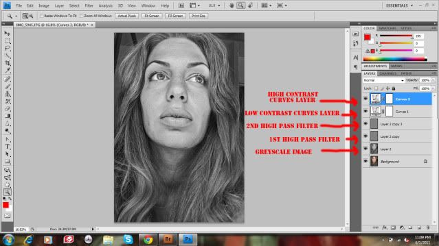
When you're satisfied, merge the B&W layers together (Layer>>Merge Down).
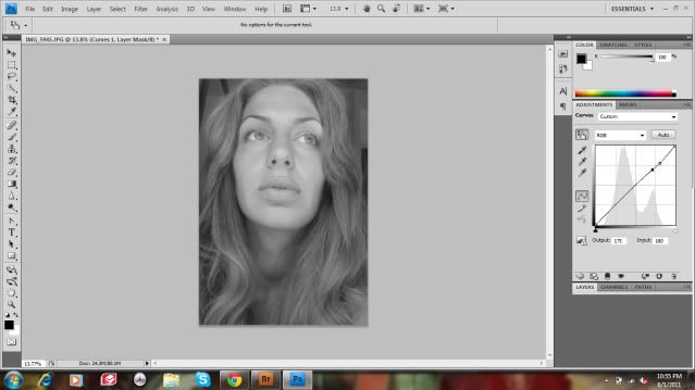
To even out the tones even more, I created a Curves layer to very slightly decrease the contrast, by making my brights darker, and my darks brighter.

Now, to get "sketchy." Make a copy of your B&W layer, and then you're going to apply the High Pass filter (Filter>>Other>>High Pass). As I'm writing this, my husband leans over and says, "High pass filters are for music, dummy," and he's right! In music, a high pass filter is used to only allow certain high frequencies through the amplifier. In the case of Photoshop, the "frequencies" allowed by the High Pass filter are the concentrated high contrast ares, like edges. The filter then boosts the saturation in these areas. The High Pass filter is especially useful in that it only affects the edges and details of an image, allowing you to sharpen just those and reduce noise sharpening in broader areas like skin.

When you choose High Pass, a window will pop up with a preview of the image and a slider prompting you to choose your radius in pixels. With a smaller radius your details will be more defined, and with a wider radius they'll be, well, wider. For this layer I'm choosing a wider radius. How little or big you choose to go depends on the size of your image, and of course, you! Play with it.

Once your filter has been applied, go to your Blending Mode menu on the Layers palette (it should say "Normal" to begin with). You'll want to choose either Soft Light, Overlay, or Hard Light (circled). I recommend either Overlay or Hard Light as they create a more drastic effect, and you can then modulate that with the layer's opacity (circled).
I then repeat this process by creating another copy of the original B&W layer and applying the High Pass filter again, this time with a smaller pixel radius.
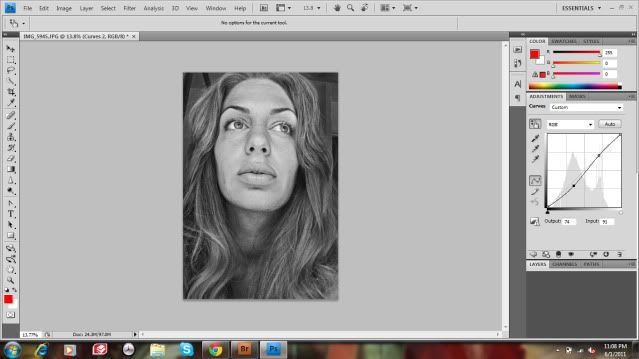
As a finishing touch, I create another Curves layer to just slightly boost the contrast, and....
You're done!