Jenny.


This girl is crazy! It was already in the 30s (and around 10 p.m.) when we were shooting these, but being only 3 blocks from Lake Eerie in Cleveland, OH and battered by the wind coming off the water dropped the temperature at least to the 20s. Still, this gal wanted to model outside in her flirty summer dress, so I bundled up in 3 coats, a scarf, a hat, and a hood, and out we went!
~
Sunday, December 6, 2009
0
comments


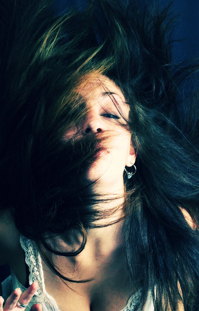
Katrina, Cocoa Jeans.


These didn't make the cut but were still quite the experience to shoot. I couldn't see a thing through my viewfinder or on my LCD and my model could barely keep her eyes open because of the excessive chlorine. What a night! Can't wait to try more underwater photography though.
~
Sunday, September 27, 2009
0
comments
Lake Don Pedro, California


I'd never been to Lake Don Pedro despite living only a few minutes away. It made for a wonderful weekend of tubing, wake boarding, and testing out my new underwater camera. Excellence!
~
Saturday, September 19, 2009
0
comments


Lay it on me, baby!
 |
Whenever post processing, there is one tool you should never overlook: layers. The use of layers in your image allows you to alter the entire image with room for error--you can always go back and delete or edit one--or even just parts of the images independently without altering the entire picture.
That aside, what I primarily use layers for is blending. The different blending modes and opacity that you can apply to a layer can give you endless effects for creating composites, faux multiple exposures, textures, and whatever else your artistic brain can think of.
Opacity is the level of transparency a layer (or a tool) has. At the default 100% a layer isn't see-through at all, however if you lower the opacity, 75%, 50%, 23% whatever you like, you can achieve multiple levels of transparency. You can change the opacity of a layer using the bar on the top of layers palette, and the similar one on your brush toolbar if wanting to change the opacity of a brush. Play with it until you find something you like!
Blending modes can also be applied to different tools (brushes, etc.) as well, but the blending mode works stays the same. Blending you layers affects how the part of the image you're working with will look over the underlying layer(s).
On your layers palete there's a drop-down menu that contains your blending modes (see left). When you create a new layer this will default to "normal." This is exactly what it sounds like, a copy of your original layer, a new blank layer, whatever you've created, no strings attached. Anything you draw on there will appear exactly as you've drawn it, regardless of underlying layers. Now, to change it up! I'll be using these two images:
 |  |
The photo of the model as my background layer, and the photo of the clouds as my active blending layer. I have skipped a few blend modes in detail, but here in short: The dissolve blending mode only effects softened/feathered edges and pixelates them. The behind blending mode does just that, makes your active layer visible only in transparent pixels in your background layer (this is only applicable to tools), making it look as if it is behind it. And the clear blending mode (also only works on tools), makes your active layer create transparencies on the background layer. Moving on!
| Darken Darken applies only the pixels in your active layer that are darker than the pixels below. Thus, lighter pixels in your background layer are replaced but darker ones stay the same. In the example image: the model's hair stays the same since it is darker than the blues and whites of the sky, however the paleness of his skin is lighter than the blue sky and is changed. |  |
 | Multiply The multiple blend mode multiplies (duh) the background pixels by the active pixels. Any black pixels will become black, and any white ones will remain the same, while everything in a between becomes a darker (multiplied) color. Note the (mostly) white cloud on his (mostly) white collar remains (mostly) intact. |
| Color Burn Color burn blending darkens the background pixels to reflect the active color through increased contrast, leaving you with bright, "burnt" colors. Whites will stay white (ex. his collar). In the example the background and sweater are a neutral gray, and thus change to a bright blue. His skin on the other hand is mostly red, which when darken gives you the red/blue/purple effect that you see. |  |
 | Linear Burn Much like the color burn mentioned above, linear burn darken the background layer to reflect the color of the active layer, however it does this by reducing brightness, thus giving you a less high-contrast image. |
| Lighten Lighten applies pixels in the active layer only if they are lighter than those in the background layer (opposite of darken, if you didn't catch that already). So, pixels darker than those in the active layer are replaced (ex. his now light blue hair), while those that are lighter aren't (ex. his collar). |  |
 | Screen A screen layer will create, well, a screen-like effect. It works opposite to multiply, multiplying the inverse of both the background layer and the active layer, resulting in a lighter, "screened" image. Using black in your active layer will have no effect, while using white will just leave white. |
| Color Dodge Color dodge brightens the pixels in the background layer to reflect the color of the active layer through contrast. The brighter the color in the active layer (like the whites and light blues in the sky image) the more intense the effect, while blending with darker colors (in either layer) creates little or no effect (ex. his hair and eye). |  |
 | Linear Dodge Linear dodge brightens the pixels in the background layer to reflect the color of the active layer by increasing brightness. Again, the same rules apple as do with color dodge, though with a smoother feel. |
| Overlay Overlay multiplies or screens the active pixels depending on the background pixels. Shadows and highlights of the background layer remains the same, while the colors of both layers are blended, leaving both layers distinct while still meshed. (I'm a big fan of overlay layers!) |  |
 | Soft Light Soft light darkens of brightens the colors of the background layer depending on the colors in the active layer (lighter active colors=lighter blended colors, darker active colors=darker blended colors). Using pure black or pure white leaves you with darker or lighter areas, but not flat black or white. |
| Hard Light Like overlay, hard light multiplies or screens the background colors depending on the active colors, though much more harsh and almost always darker. Unlike soft light however, using flat black or flat white will leave you with just that, flat black or white. |  |
 | Vivid Light Vivid light layers burn and dodge the background layer depending on the active layer by boosting contrast, thus the blown out highlights and darkened shadows in the example image. |
| Linear Light Linear light darkens or lightens the background layer by altering brightness based on the active layer. Lighter areas (ex. clouds) are lightened by increasing brightness, and darker areas (ex. hair) darkened by decreasing brightness. |  |
 | Pin Light Pin light replaces the colors in the background layer depending on the active layer. If the active pixels are brighter than 50% gray, pixels darker than those in the active layer are replaced, while lighter ones stay the same. If the active pixels are darker than 50% gray, the effect is reversed--lighter pixels are replaced, while darker ones stay the same. In the example: The lightest parts of the clouds replace the darker background, though the shadows in the clouds (since they are now darker than the background) adopt the gray of the backdrop. |
| Difference A difference layer inverts the background layer based on the active layer. White inverts colors completely, while black doesn't at all, and everything in between creates an inverted blend. |  |
 | Exclusion Exclusions layers work the same as difference layers, though are lower in contrast. Mid-tones, instead of brightly blending, are changed to a shade of gray. |
| Hue A hue layer does exactly that--changes the hue of the background layer to that of the active layer (ex. skin color turning blue). |  |
 | Saturation A saturation layer retains the hues and luminance (the brightness of a chosen color) of the backgrounds layer but blends the saturation of the active layer. Pure blacks, grays, and white will have no effect. |
| Color Color applies the hue and saturation of the active layer to the luminance of the background layer. This is much like coloring in a BW image. |  |
 | Luminosity Luminosity retains the saturation and hue of the background layer (ex. the beige/pink of the model's skin) as well as the luminance of the active layer. |
~
Tuesday, June 9, 2009
0
comments
Moon Prism Power!
 |
I've gotten a lot of questions and request for a tutorial on creating the Sailor Moon-esque, light painting composites I've been into lately. So, here's a quick (albeit sloppy) tutorial!
I drew this up in about 20 minutes, but I recommend playing around with this look and technique and figuring out exactly what you want from the images. Some stuff will work, some won't. Practice makes perfect. Don't just copy pixel for pixel, get creative, make it yours!
I used stock images for this tutorial from stock.xchg (you can even see the window open at the bottom of my screenshots, haha), however my previous pieces were a combination of portraits shot in studio and my own stock. For a look at these you can check them out on my Flickr-- one, two, three, & four.

Of course start out by opening your image. I chose this one because I want to get the effect of her flying, and also because it will be easy to remove the grass from the background. If I were shooting for this I'd shoot in studio to have an even colored, flat background for all the glitz, glitter, and light to lay over as I'm working. A picture with a busy background will only end up looking sloppy and way too busy. The images in this tutorial are kind of small, but if you click on them you can view them fullsize.

I just used the brush tool to go over the parts of the background I didn't like (grass and clouds), as well as the empty space that was created when I moved the girl over towards the other side of the image. The brush strokes you can see aren't that big of a deal. They are more or less the same color and tone as the rest of the background, so they won't show in the end product.Now, to get the glittery effect I used a bokeh picture, or something similar. Pictures of clouds, stars, flowers, whatever will work too, it's all up to you!

Now, I set the blending mode on the layers palette to "screen." This gives the layer that see through effect. Play with the other blending modes if you want until you find something that you like, though I tend to stick to screen or overlay for this one.You might now want all the sparkles all over you subject, so I recommend creating a layer mask (Layer menu>>Layer Mask>>Reveal All). This will let you erase parts of the layer but be able to go back and edit your erasures are you wish.

I set my brush's opacity to 48, strong enough to get rid of what I don't want to see, but subtle enough to not look like I just chopped something out. Select the layer mask on your layer palette and just paint away what you don't want! If you want to add something back in, just switch your brush to white (or hit "x") and paint back over.On to the lights! For these I used three different light painting images, but I'll just show you the basics with one.

You can stretch and warp this to fit your picture if you need, the distortion won't really be visible. I create a curves layer to boost the contrast on the lights. I try to keep everything black so that it won't show once I change the blending mode. Merge the curves layer to the lights layer. Now change the blending mode. Either screen or color dodge works well, depending on how intense you want the light streaks to be. In this case I set all my light layers to screen.

I then copied the layer and applied a gaussian blur filter to give it a little more glow.I repeated these steps on my other two light layers, and voila!

If I were going to a more polished look, in the layer masks on each I'd mask out which parts of the light I wanted behind the model, to give the effect that it was wrapping around her. I also added an additional curves layer to get the contrast the way I wanted and there you are! All done!

~
Friday, June 5, 2009
0
comments